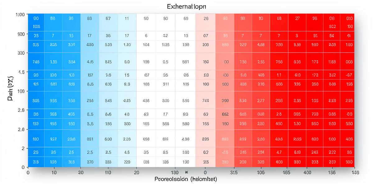
What is a Correlation Heatmap?
A correlation heatmap is a visual representation of how different variables in your dataset relate to each other. It's one of the most useful tools for understanding your data because it can reveal hidden patterns and relationships at a glance.
When you upload a dataset to Analyze Table, we automatically generate a correlation heatmap if you have multiple numeric columns. But knowing how to read it is essential to getting value from the visualization.
Understanding Correlation Values
Correlation is measured on a scale from -1 to +1:
- +1: Perfect positive correlation (as one variable increases, the other always increases by a proportional amount)
- 0: No correlation (the variables are unrelated)
- -1: Perfect negative correlation (as one variable increases, the other always decreases by a proportional amount)
In practice, you'll rarely see perfect +1 or -1 correlations in real-world data. Here's how to interpret the values you'll actually encounter:
- 0.7 to 1.0: Strong positive correlation
- 0.4 to 0.7: Moderate positive correlation
- 0.1 to 0.4: Weak positive correlation
- -0.1 to 0.1: No meaningful correlation
- -0.4 to -0.1: Weak negative correlation
- -0.7 to -0.4: Moderate negative correlation
- -1.0 to -0.7: Strong negative correlation
Reading the Color Scale
Correlation heatmaps use color to represent the strength and direction of relationships:
- Red/Hot colors: Positive correlation (both variables move in the same direction)
- Blue/Cool colors: Negative correlation (variables move in opposite directions)
- White/Neutral colors: No correlation (variables are unrelated)
The darker or more saturated the color, the stronger the correlation. A deep red indicates a strong positive relationship, while a deep blue indicates a strong negative relationship.
The Diagonal Line
You'll notice that the diagonal from top-left to bottom-right always shows the darkest color (usually dark red or 1.0). This makes sense: each variable has a perfect correlation with itself. This diagonal line helps you orient yourself when reading the heatmap.
Symmetry Across the Diagonal
The heatmap is symmetrical. The correlation between Variable A and Variable B is the same as the correlation between Variable B and Variable A. So the top-right triangle mirrors the bottom-left triangle. You only need to read one half of the heatmap.
Practical Examples
Example 1: Sales Data
Imagine you have sales data with columns for marketing_spend, sales_revenue, and customer_satisfaction. Your correlation heatmap shows:
- marketing_spend ↔ sales_revenue: 0.78 (strong positive) - Higher marketing spend is strongly associated with higher revenue
- marketing_spend ↔ customer_satisfaction: 0.15 (weak positive) - Marketing spend has little relationship with satisfaction
- sales_revenue ↔ customer_satisfaction: 0.62 (moderate positive) - Higher revenue correlates moderately with better satisfaction
From this, you might conclude that marketing spend effectively drives revenue, but doesn't directly impact how satisfied customers are.
Example 2: Weather Data
In a weather dataset with temperature, humidity, and rainfall:
- temperature ↔ humidity: -0.55 (moderate negative) - Hotter days tend to have lower humidity
- humidity ↔ rainfall: 0.82 (strong positive) - High humidity strongly correlates with rainfall
- temperature ↔ rainfall: -0.34 (weak negative) - Slight tendency for cooler days to have more rain
What to Look For
1. Strong Unexpected Relationships
Strong correlations (above 0.7 or below -0.7) between variables you didn't expect to be related can reveal important insights about your data. These are worth investigating further.
2. Missing Expected Relationships
If two variables you thought would be strongly correlated show weak correlation, this might indicate:
- Your assumption was wrong
- There's a data quality issue
- The relationship is non-linear (correlation only measures linear relationships)
- There's a confounding variable affecting both
3. Multicollinearity
If several variables are highly correlated with each other (above 0.8), they might be measuring essentially the same thing. This can cause problems in some types of statistical analysis.
See Your Data's Correlations
Upload your spreadsheet and instantly generate a correlation heatmap with AI-powered interpretation.
Analyze Your Data NowCommon Pitfalls and Misconceptions
Correlation Does Not Mean Causation
This is the most important rule in correlation analysis. Just because two variables are correlated doesn't mean one causes the other. There could be:
- A third variable affecting both
- Reverse causation (B causes A, not A causes B)
- Pure coincidence
For example, ice cream sales and drowning deaths are correlated, but ice cream doesn't cause drowning. Both increase in summer due to the weather (the confounding variable).
Non-Linear Relationships
Correlation measures linear relationships. A correlation of 0 doesn't necessarily mean the variables are unrelated—they might have a curved, exponential, or other non-linear relationship that correlation can't detect.
Outliers Can Distort Correlations
A few extreme values can artificially inflate or deflate correlation coefficients. Always check your data for outliers before interpreting correlations.
Small Sample Sizes
Correlations calculated from small datasets (fewer than 30 observations) can be unreliable. The correlation might be due to chance rather than a real relationship.
Next Steps After Reading Your Heatmap
Once you've identified interesting correlations:
- Investigate strong relationships: Look at scatter plots to see the actual distribution of data points
- Consider causation: Think about whether there's a logical reason one variable might cause the other
- Look for confounding variables: Are there hidden factors affecting both variables?
- Test your hypotheses: Use your insights to make predictions and test them
Tips for Better Correlation Analysis
- Clean your data before analyzing—missing values and outliers affect correlations
- Use enough data points (at least 30) for reliable correlations
- Consider standardizing your variables if they're on very different scales
- Look at the actual data, not just the correlation number
- Remember that correlation can change over time—analyze different time periods separately
Conclusion
Correlation heatmaps are powerful tools for exploring relationships in your data, but they're just the starting point. Use them to identify patterns worth investigating, then dig deeper with additional analysis to understand what's really happening in your data.
The best insights come from combining the broad overview that heatmaps provide with careful examination of the underlying data and thoughtful consideration of what the relationships might mean in your specific context.